Real places, interpreted as worlds
Real-world geography, interpreted into atmospheric, collectible places - distinct enough to own, deep enough to build a world around.
Not just a terrain map
Every CryptoCities artwork begins with the terrain and mapped structure of a real place. But it does not stop at reproduction.
The terrain is a starting point - a seed of real geography that gets transformed into something more atmospheric, more collectible, and more visually alive. The result sits between strict cartography and pure fantasy: grounded in the real map, but interpreted into a world worth exploring.


The visual language
Every CryptoCities artwork shares a consistent set of visual elements. Each place is different, but they speak the same language - making the collection feel like a coherent world rather than a set of unrelated images.

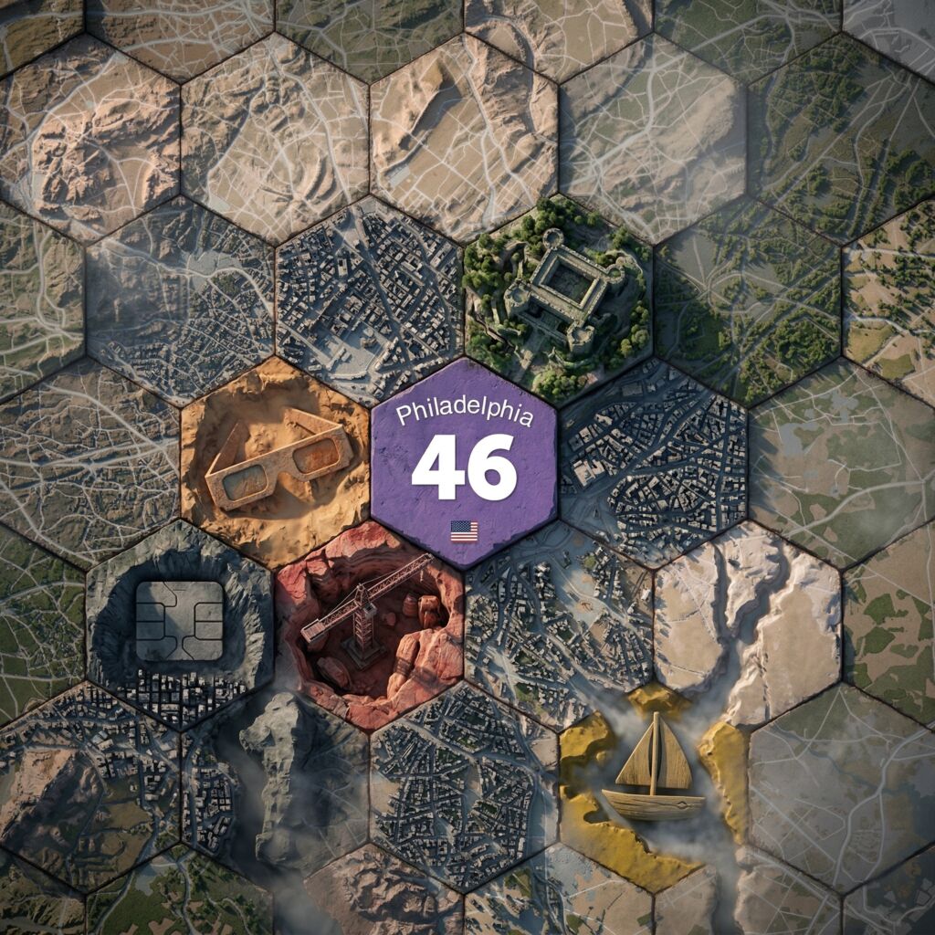
The grid
The hex grid is a visual framework that ties every artwork in the collection together. It carries forward CryptoCities' map and strategy-game roots - visible enough to feel structural, restrained enough not to dominate the composition.


The centre tile
The centre tile carries key identity information - the place name, its size, country, and consistent collection language. Smaller places tend toward quieter tones; larger places toward stronger purple emphasis.


Features
CryptoCities has 60 feature types, ranging from roads and resources to academia and research. They appear as stylised elements embedded into each artwork - not flat icons, but visual details that help make every NFT one-of-one.


Colour and atmosphere
The artwork uses fantasy hues and cinematic treatment - standard green terrain can become blues, purples, pinks, ash tones, and warmer highlights. The atmosphere is interpretive, not geographically faithful.


Strategy roots
If you grew up with Civilization, colonisation sims, or hex-grid board games, the CryptoCities visual language will feel familiar. The tiled structure, the embedded features, the sense that each place is a territory you could explore - that comes from the same emotional lineage. But CryptoCities doesn't reproduce a standardised board-game look. It's a homage to that tradition, not an imitation of it.
Continuous curation
CryptoCities artwork is AI-assisted and human-directed. Each piece begins with terrain data and place metadata - size, features, structure - and is shaped into a visually interesting, unique place. The output is reviewed for style consistency, visual quality, and correct feature placement.
Weak results are rejected, promising directions are refined - each piece is the product of iterative curation, not a single generation pass. And even once a final version is in place, it can be upgraded later as the system improves, always within the same art theme and visual language.


A living visual system
CryptoCities is not treated as a collection that had one visual moment and then stopped. Its artwork has already evolved across multiple eras, and that history matters. It shows that these places are not fixed in a single presentation forever.
As new creative tools emerge, the collection can support richer interpretation, deeper atmosphere, and more expressive ways of presenting each place. The goal is not constant churn. It is careful refinement - treating CryptoCities as a living collection rather than a frozen archive.
Visual lineage
The current art style is the third major visual era of CryptoCities. Each generation built on what came before - and each moved the project further from strict terrain accuracy toward richer interpretation.

Simple structures
Square tile game maps. The first visual identity - functional, early-stage, and part of the project's founding character. Places as grid coordinates.

Hex terrain
Real terrain data transformed into a hex-tile visual language, introduced alongside the 2021 ERC-721 upgrade. Stylised processing, colour shifts, and patterning gave each place a distinctive look grounded in geography. Places as maps.

Cinematic interpretation
The current era. Moves further from strict terrain accuracy into a fantasy cinematic environment rooted in reality. More atmospheric, more emotionally rich, and designed to feel like a world. Places as living landscapes.
A visual identity built to last
Every CryptoCities artwork carries its own geography, its own features, its own atmosphere. The visual language is consistent but every place is distinct - and that distinction is the point.
A living world where the art deepens with the project. Where visual identity has lineage. Where atmosphere, place, and character are designed to last.